Do you have a website, but not many people are clicking, signing up, or making a purchase? That can feel pretty frustrating. This is where something called a “website conversion” comes in.
What does “website conversion” mean in simple words?
A website conversion happens when someone visits your website and does something you want, like buying a product, filling out a form, or clicking a button. Think of it this way: if 100 people visit your website and 5 make a purchase, you have 5 conversions.
Why is it important for websites?
Getting more people to take action on your website means more sales, more sign-ups, or more fans. Even if you have lots of visitors, if they don’t do anything, your website isn’t helping much. That’s why increasing website conversions is super important; it helps you reach your goals.
What will you learn here?
In this blog, we’ll share 5 easy and proven tips to help you increase website conversions. These tips are simple, work for almost any website, and you don’t need to be a tech expert to use them. Let’s get started!
1. Use Clear Call-to-Actions (CTAs)
Why Clear CTAs Help Increase Website Conversions
A Call-to-Action (CTA) is a short message that tells people what to do next on your website. It’s like giving a friendly instruction. For example, when you see
a button that says “Buy Now”, “Sign Up Today”, or “Get a Free Trial”, that’s a CTA.
CTAs help guide your visitors so they don’t feel lost. Without a clear CTA, people might visit your site and leave without doing anything!
Examples of Good and Bad CTAs
Let’s look at some examples so it’s super clear:
Good CTAs:
- “Download Your Free Guide”
- “Start Your Free Trial”
- “Book an Appointment Now”
- “Get 10% Off Today”
Bad CTAs:
- “Click Here” (Too vague)
- “Submit” (What are they submitting?)
- “Next” (Next for what?)
Good CTAs tell people exactly what will happen and why they should click.
Where to Place CTAs on a Website
Placing your CTA in the right spot is just as important as writing it well. Here’s where to put them:
- At the top of your homepage, so visitors see it right away
- After explaining your product or service
- At the bottom of each page
- Inside a pop-up or sticky bar that stays visible
Tip: Don’t hide your CTA in a corner or under a lot of text. It should stand out clearly!
Keep Buttons Big, Bright, and Easy to Understand
Make sure your CTA buttons are:
- Big enough to see and click
- Bright in color (like red, green, or blue)
- Easy to read with clear words
- Surrounded by space, so they don’t blend in with everything else
Think of your CTA button like a stop sign; it should grab attention right away!
2. Make Your Website Super Easy to Use
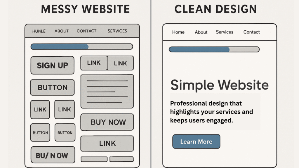
Simple Design = More Website Conversions
Why Clean Layout and Fast Speed Matter
Imagine walking into a store where everything is messy, signs are hard to read, and it takes forever to find what you want. Would you stay there? Probably not!
The same thing happens with websites. If your website looks messy or loads slowly, people will leave quickly. A clean and fast website helps visitors stay longer and take action—this means more website conversions.
Fast websites make people happy. Slow ones make people leave. That’s why speed and design matter so much.
How Too Much Stuff Confuses Visitors
If your homepage is packed with too many buttons, images, or flashy things, visitors might feel lost. When people get confused, they stop clicking. That’s bad for your website conversion rate.
Less is more! Try not to add everything at once. Keep things simple so your visitor knows where to go next.
Tips to Make Your Website Easy and Clear
Here are some easy ways to fix your website and help people take action:
Use Simple Menus
- Only add the most important links (like Home, About, Services, Contact).
- Group things nicely so it’s not overwhelming.
Pick Readable Fonts
- Use clean fonts like Arial or Roboto.
- Make the size big enough to read on phones and computers.
Make Sure Your Website Loads Fast
- Use small image sizes (but still clear).
- Don’t add too many moving things like sliders or auto-play videos.
- Use tools like Google PageSpeed to see how fast your website loads.
A website that is simple, fast, and easy to use will turn more visitors into customers. That’s how you increase website conversions the smart way.
3. Add Customer Reviews and Trust Signals
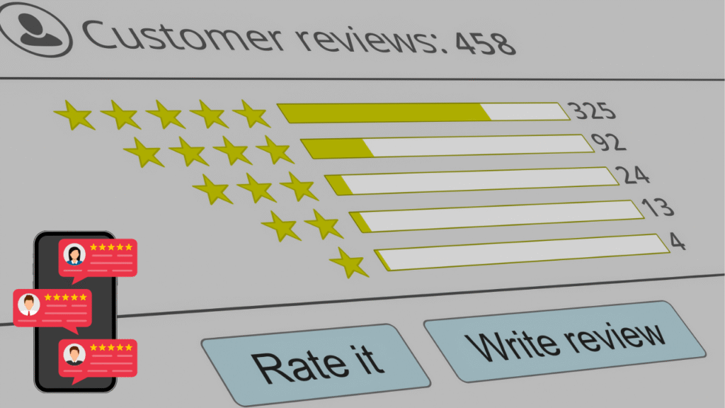
How Trust Increases Website Conversions
Trust signals are signs that show your website is safe, honest, and worth using. When visitors feel they can trust your website, they’re more likely to buy something, sign up, or contact you. That’s a win for your website conversions!
Here are some examples of trust signals:
-
Customer Reviews – Honest feedback from real users builds credibility.
-
Star Ratings – Quick visual proof of product quality.
-
Security Badges – Symbols like SSL or “Secure Checkout” reassure users.
-
Trusted Payment Logos – Logos from Visa, Mastercard, PayPal, etc., signal safety.
-
Short Testimonials – Brief quotes from happy customers can boost confidence.
These simple things make visitors feel safe and confident.
Real Stories from Happy Customers Make Others Trust You
People like to hear what others say before they make a decision. That’s why real stories from happy customers are powerful.
If someone writes, “This product helped me so much!” or “The service was super fast,” it makes new visitors feel like they can trust you, too.
Honest reviews are better than perfect ones. A mix of great and okay reviews seems more honest and builds trust.
How to Display Reviews the Smart Way
Here’s how to show reviews in a way that boosts your website conversions:
- Put reviews on your homepage so visitors see them right away
- Add them near products or service pages
- Use star ratings under product titles
- Show photos of real people (if possible) with their feedback
- Include the person’s name or initials to make it feel real
Bonus Tip: Ask your happy customers to leave a quick review. Even one or two reviews can make a big difference!
4. Use Smart Pop-Ups Without Annoying Visitors
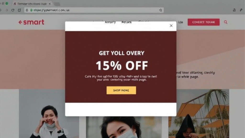
Do Pop-Ups Really Help Increase Website Conversions?
Yes, pop-ups can help you increase website conversions—if you use them the right way. A pop-up is a small message that appears while someone is visiting your site. You’ve probably seen one before:
- “Get 10% Off Today!”
- “Wait! Don’t leave yet—grab your free guide!”
These can grab attention and get people to take action—but only if they are helpful, not annoying.
Pop-Up Types That Work
Here are some pop-up types that actually work and help boost your conversions:
Exit Intent Pop-Ups
– These show up when someone is about to leave your site. They say things like: “Before you go, here’s a free tip!”
Discount Offer Pop-Ups
– Show a small deal like “Get 15% off your first order” when someone visits your store.
Email Sign-Up Pop-Ups
– Offer something cool (like a free ebook or guide) in exchange for an email.
Limited-Time Offer Pop-Ups
– Make it feel urgent: “Just 2 hours left to get 20% off!
Smart pop-ups give visitors something helpful or fun. That’s what makes them work.
Best Time to Show Pop-Ups
The timing of a pop-up is super important. If you show it too fast, people might close it before reading it. If you show it too late, they may already be gone.
Here’s when to show them:
- After 10–15 seconds of visiting a page
- When someone scrolls to the middle of the page
- Right before they leave (exit intent)
- After a visitor clicks a button or stays for a while
This way, your pop-up feels helpful, not pushy.
Make Sure Pop-Ups Don’t Ruin the User Experience
Even good pop-ups can hurt your website conversions if they’re annoying. Here’s how to avoid that:
Don’t show too many pop-ups at once
Don’t block the whole screen
Don’t make it hard to close
Do offer value (discount, freebie, tip)
Do make it quick and clear
Pop-ups should feel like a helpful surprise, not a loud ad. Use them wisely, and your conversions will thank you!
5. Improve Your Mobile Experience

Why Mobile Matters More Than Ever
Today, most people use their phones to visit websites. They shop, read blogs, and sign up for things right from their small screens. If your website doesn’t work well on a phone, people will leave fast, and that means lower website conversions.
If visitors have to zoom in, scroll side to side, or wait for slow pages, they won’t stay. But if your website looks good and works smoothly on mobile, more people will click, buy, or sign up.
How to Test If Your Website Works Well on Phones
You can easily check how your website looks on a phone by doing these things:
Open your website on your phone
– Try clicking buttons, reading text, and filling forms. Is it easy or hard?
Use Google’s Mobile-Friendly Test
– Just search “Google Mobile-Friendly Test,” paste your link, and see the result.
Check on different devices
– Try it on a tablet, a small phone, and a big phone to see how it changes.
If the text is hard to read or the buttons are too small, you should fix the design.
Tips for Better Mobile Layout
Here’s how to make your mobile website friendly and boost your website conversions:
Use Thumb-Friendly Buttons
– Make buttons big enough so people can tap them easily without zooming.
Keep Text Easy to Read
– Use large fonts and short paragraphs. Avoid tiny writing or squished text.
Avoid Zooming and Side Scrolling
– Make sure everything fits the screen. No one likes moving left and right to read.
Make Menus Simple
– Use a small “hamburger” menu (three lines) to keep things tidy and easy to tap.
Test Speed on Mobile
– Use tools like PageSpeed Insights to check how fast your mobile site loads. Fast is best!
When your website works great on mobile, more visitors will stay longer and take action. That means better results and more success for you!
Bonus Tips to Increase Website Conversions

More Simple Ways to Get More Conversions
You’ve already learned 5 awesome ways to boost your website conversions. But wait, there’s more! These bonus tips are easy to use and can give you even better results.
Add Live Chat Support
Sometimes visitors have questions and need answers fast. If they can’t find help, they may leave your website. But if you add live chat support, they can ask questions and get help right away.
This makes people feel cared for, and they’re more likely to trust you—and take action!
You can use tools like:
- Tawk.to (free and easy)
- LiveChat
- Facebook Messenger plugins
Even having a chatbot to answer common questions helps keep people on your site longer, and that means more website conversions.
Use Videos to Explain Your Product or Service
People love watching short videos. Instead of reading a lot of text, a video can show how your product or service works in just a minute or two.
A great video can:
- Show what your product does
- Explain how it solves a problem
- Build trust with your audience
- Make your brand feel real and friendly
Just make sure your video is short, clear, and easy to understand. You can add it to your homepage, landing page, or product pages.
A/B Testing Made Simple: Try Small Changes and See What Works
A/B testing sounds fancy, but it’s really simple. It just means you test two versions of something to see which one works better.
Example:
- Try two different CTA buttons — “Buy Now” vs “Get Yours Today”
- Change a headline and see which one gets more clicks
- Test different images or colors
You can use tools like Google Optimize or Hotjar to run these tests. Small changes can lead to big results over time and help you grow your website conversions without guessing.
Conclusion
We’ve just walked through 5 easy and proven tips to help you increase your website conversions—plus some bonus ideas! Here’s a quick recap:
Use Clear CTAs – Tell your visitors what to do next
Make Your Website Easy to Use – Keep it simple, clean, and fast
Add Customer Reviews and Trust Signals – Let people see that others trust you
Use Smart Pop-Ups – Grab attention without being annoying
Improve Mobile Experience – Make sure your site works great on phones
And don’t forget the bonus tips like adding live chat, using short videos, and trying A/B testing!
Final Advice: Keep Testing and Improving
The best websites are always growing. Try something new, watch what works, and keep improving. You don’t need to be perfect—just keep moving forward step by step. Even little changes can make a big difference!
Call to Action: Start Applying One Tip Today!
Pick just one of these tips and try it on your website today. Maybe it’s fixing your CTA or adding a customer review. Once you start, you’ll feel more confident, and your conversions will grow faster than you think!
FAQs – How to Increase Website Conversions
Q1. What is a good website conversion rate?
A good website conversion rate is usually between 2% and 5%. But this can change depending on what kind of website you have. Some sites get more, and some get less—and that’s okay!
Q2. Can I increase conversions without spending money?
Yes, you can! Many of the tips in this blog—like using better Call-to-Actions, speeding up your website, and making your layout simple—are totally free. You don’t always need to pay to make your website better.
Q3. Why do people leave my website without doing anything?
People often leave because:
- The website is too slow
- The layout is confusing
- They don’t know what to click next
- People won’t trust it if there are no reviews or real info
Fixing these things can help you keep visitors and increase website conversions.
Q4. Are pop-ups safe to use?
Yes! Pop-ups are acceptable if used correctly. Don’t show too many, and make sure you offer something helpful, like a discount, free guide, or bonus tip. Always make it easy to close the pop-up, too.
Q5. How do I track my website conversions?
You can use free tools like:
- Google Analytics – Shows how many people visit and what they click
- Hotjar – Shows heatmaps and where visitors are spending time
These tools help you see what’s working and what needs to change to get better conversion results.

